-
Architects: Agathe Marimbert Architecte, NAED bureau d'architecture
- Area: 1800 m²
- Year: 2021
-
Photographs:Simone Bossi
-
Manufacturers: STACBOND, Arcelor Mittal, Bolon, Sfel

Text description provided by the architects. Located in the “parc international d’entreprises” of Val d’Europe, in Bailly -Romainvilliers (FR), the project is in the heart of a rapidly growing monofunctional economic activity zone, following the establishment of Disneyland Paris.

Architectural intention. With this context in mind, the project had to put forward a strong architectural identity within a site and a region that has an indistinct architectural identity, made of pastiches.

The architects decided to enhance and re-interpret the industrial nature of the site within its architectural language, in an attempt to initiate a dialogue with the neighboring factories. By using simple and industrial materials, the architects wanted to convey a certain simplicity and discretion. The project questions the archetype of what business premises should look like in an economic activity zone. The idea is simple: build a cost-effective and long-lasting construction that reflects its function, whilst offering a high-quality workplace for its users.

The project offers two distinct access points: the pedestrian and car entrance are located south-west of the site, while the lorries access the site from the north-west entrance. A turning area, located between the two main buildings, allows lorries to maneuver on the site. This dissociation grants security and ease of use, creating two separate areas on the site: the northern part of the site handles the supply constraints, while the southern part responds to the office needs of the program. Office spaces are oriented west and south, while the storage spaces and loading areas face north and east.


Volumetry / materiality. In order to break their linearity, the facades offer recessed volumes to mark the entrances, that are adorned with contrasting materiality. In order to preserve a volumetric unity, the upper part of the cladding of the main façade goes over these volumes, allowing the simplicity of form, while emphasizing the transparent subtlety of the metallic mesh that filters the sun on those spaces. The slight curvature of the roof creates a more dynamic volume and marks the entrance of the site from the surrounding areas.


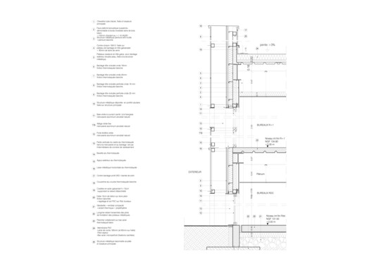
The steel frame structure of the building led the architects to choose a cladding with similar materiality. The two buildings reflect their program and are adorned with a simple white corrugated steel cladding, typical in the industrial field. A wave difference in the white cladding, between the ground and the first floor, creates a slight visual variation of the two stories and accentuates the stratum effect. The same cladding is used in perforated form to create a metallic mesh that wraps the buildings, filters the solar gain, and offers ethereal views from the inside. The use of the same wave between the constructive facade and the mesh allows a smooth transition between the two complexes. In contrast, the patios are cladded with anodized cassettes, bringing warmth and contrast to the entrance spaces.


Interior. The interior follows the initial manifest and reveals the constructive system of the building: the collaborative metal form-slab and the steel roof are visible, as well as the steel frame structure. The electrical and ventilation systems are visible, except in the offices, where a white wood wool ceiling is used to create an acoustically comfortable workspace. Woven vinyl flooring with red hints combined with timber and glass partitions complete the palette.


